Start with viewing distance
Every signage decision starts with one question: how far away is the person who needs to read it? Measure or estimate the distance from the sign to where guests will realistically stand or walk, then size the lettering to that distance.
A widely used rule of thumb is about one inch of capital letter height for every ten feet of viewing distance for comfortable reading, and never less than one inch per twenty-five feet for maximum legibility. So a directional sign read from 50 feet wants roughly 5-inch letters; a sponsor board read from 100 feet wants 10-inch letters or larger. Round up whenever a sign will be read while walking, in low light or by an older audience.
Recommended sizes by sign type
Wayfinding and directional signs: read from 30 to 60 feet, so 3- to 6-inch letters on a panel of at least 24 by 36 inches. Keep to one or two lines, with an arrow that is as tall as the letters.
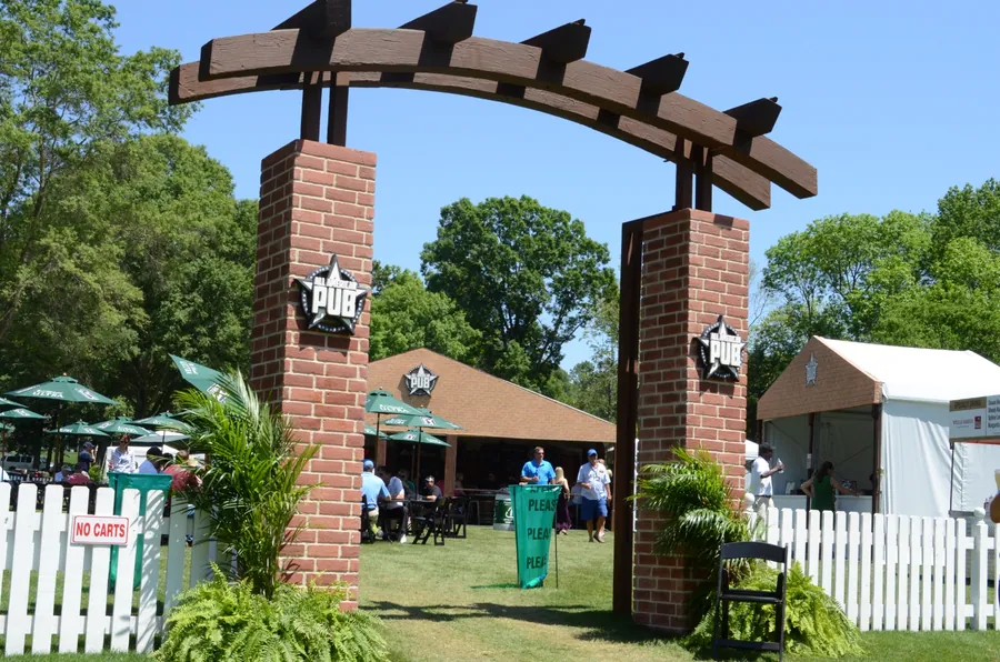
Entry and gateway signage: read on approach from 100 feet or more, so 10- to 18-inch letters or a full-width branded panel above the opening. Gateways are also photographed, so give the mark clear space on all sides.
Sponsor boards and partner walls: primary sponsor marks at 12 inches or taller, secondary partners at 4 to 6 inches, arranged in tiers. Leave a margin around every logo equal to at least half its height.
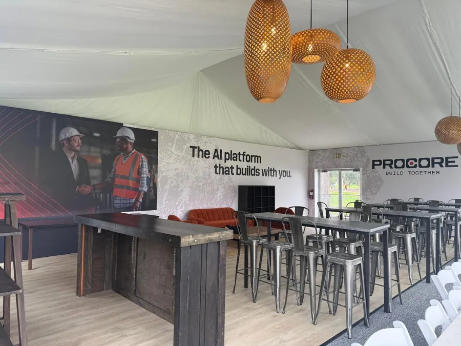
Stage and press backdrops: a repeating pattern of marks between 6 and 10 inches high reads well on camera without one logo being cut off by a speaker. Backdrops for a podium need at least 8 feet of height and 12 feet of width to fill a broadcast frame.
Banners on fences and buildings: sized to the structure, but the headline should be at least 12 inches high for a banner read across a street or a fairway. Wind load matters: mesh or wind-slit material for anything over about 3 by 8 feet outdoors.
Tee markers and tee box backs: markers are read by players standing a few feet away, so 2- to 3-inch lettering on the marker face is plenty; tee box backs are read by spectators from 30 to 50 feet and want 4- to 6-inch marks with a tagline no smaller than 3 inches.
Menu boards and counter fascias: menus are read from 6 to 12 feet across a counter, so 1- to 1.5-inch item text with 3- to 4-inch headers; fascia identification is read from across a tent, so 8 inches and up.
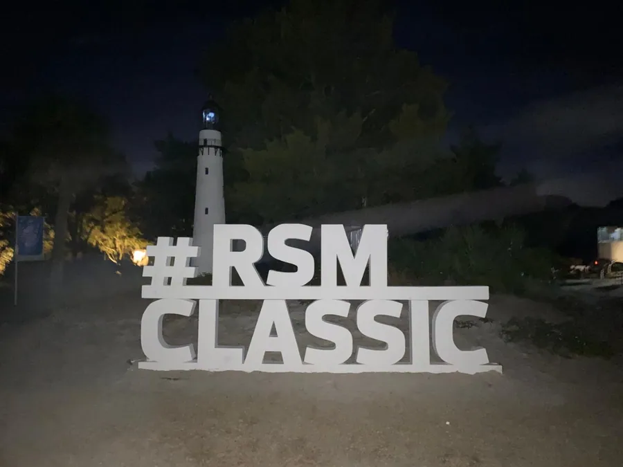
Oversized dimensional letters: photo-moment letters are typically 3 to 8 feet tall. Below 3 feet they stop reading as a feature; above 8 feet they need engineering for wind and footings on grass.
Contrast, type and color
Contrast does more for legibility than size. Dark letters on a light field or light letters on a dark field both work; mid-tone on mid-tone does not. Avoid placing type over busy photography without a solid or gradient panel behind it.
Use a clean sans-serif or the brand's approved display face with generous letter spacing. Thin weights disappear outdoors; choose regular or bold. Uppercase reads best on short directional signs; mixed case reads best for anything longer than three words.
Brand colors shift between substrates. Ask for a printed color draw-down on the actual material before a large run, especially for foam letters, fabric and mesh.
Materials by job
- Rigid panels for wayfinding and sponsor boards: aluminum composite or PVC for outdoors, foam board for short indoor use.
- Fabric for stage and press backdrops: tension fabric prints are wrinkle-free on camera and pack small.
- Vinyl or mesh for banners: mesh where wind is a factor; solid vinyl where you need full color saturation and the banner is sheltered.
- High-density foam or PVC for dimensional letters and logos, with internal framing for anything tall or lit.
- Turf-safe bases and painted timber for tee markers and on-course pieces that need to be moved daily.
Preparing artwork
Send vector artwork (AI, EPS or PDF) for logos and type. For photography, supply files at 100 to 150 pixels per inch at the final printed size, or larger. Include bleed of at least half an inch on rigid prints and two inches on fabric and banners.
Confirm final sizes in inches and mark which edge is the top. When a graphic wraps a structure, ask the fabricator for a template before you lay out the art.
Allow time for scaled proofs. A proof printed at 25 percent scale, taped to a wall and viewed from the real distance, catches most sizing mistakes before production.
Quick reference
- 10 feet away: 1-inch letters minimum, 2 inches comfortable.
- 25 feet away: 2.5-inch letters minimum, 3 to 4 inches comfortable.
- 50 feet away: 5-inch letters minimum, 6 to 8 inches comfortable.
- 100 feet away: 10-inch letters minimum, 12 inches and up comfortable.
- 200 feet away: 20-inch letters minimum, 24 inches and up comfortable.